Industry
Blockchain / DeFi / Fintech
Client
ONCHAIN Labs
Role
Design Lead (Hands-on)
Scope
UX/UI, Product Strategy, System Design
From fragmented onboarding to a structured transaction system
Redesigning the end-to-end fiat-to-crypto experience, transforming a disjointed onboarding and transaction flow into a clear, guided system that builds trust and scales across products.
Impact
5-step onboarding system
Guided activation replacing fragmented setup
4 key system states
Loading, verification, completion, empty states
End-to-end flow redesign
Signup > asset setup > transactions

Context
ONCHAIN enables projects to sell digital assets directly to users using fiat, removing intermediaries and enabling direct monetization.
However, the product experience did not reflect this promise.
The onboarding, setup, and transaction flows were fragmented across multiple disconnected steps, making it difficult for users to understand:
What to do next
What was required from them
Whether they had successfully completed setup
This created hesitation at critical moments, especially in a product where trust and clarity are essential.
Problem
The experience was not a single flow, it was a collection of isolated steps.
Key issues:
No clear progression across onboarding
Lack of system feedback (verification, completion, status)
Weak hierarchy in critical forms (personal info, asset setup)
No clear mental model of "where am I in the process?"
Dashboard lacked meaningful states (empty, loading, success)
Users were forced to interpret the system instead of being guided by it.
Goal
Transform the experience into a structured, guided system that:
Provides clear progression from signup to activation
Reduces cognitive load during onboarding
Builds trust at key commitment moments
Introduces system feedback (states, validation, progress)
Creates a scalable foundation for future product expansion
Approach
Instead of redesigning individual screens, the focus was on restructuring the entire experience as a system.
Key principles:
Progress over pages > turn flows into guided sequences
Visibility of state > always show what’s happening
Reduce decision anxiety > simplify inputs and choices
System consistency > unify patterns across onboarding and dashboard
Trust-first UX > reinforce clarity at critical steps
This required aligning onboarding, setup, and dashboard into a single coherent journey.
Core Transformation
From disconnected steps to a guided onboarding system
The onboarding experience was redesigned as a structured, step-by-step system, replacing disconnected actions with a clear path from signup to activation.
Before
UX issue
The onboarding experience was fragmented across disconnected steps, with no clear progression or feedback about where users were in the process.

Forms presented as isolated steps
No sense of progress or completion
Overloaded inputs with little hierarchy
No feedback during setup
Users unsure what comes next
After
Design Goal
Create a guided onboarding system that introduces clear progression, structured steps, and visible system feedback from signup to activation.

Clear step-by-step onboarding structure
Persistent progress indicator
Grouped and simplified inputs
System feedback (loading, verifying, success)
Defined path from signup > activation
Onboarding System
Designing a structured setup experience
Extending the System

The onboarding was transformed into a guided system with explicit steps:
Account creation and verification
Digital asset setup
Payment configuration
Plan selection
Account verification

Each step provides:
Clear context
Focused inputs
Immediate feedback
Visible progress
This removes ambiguity and creates a predictable experience.
System feedback & states
Making system status visible
A major gap in the original experience was the lack of system feedback.
The redesign introduced explicit states:
Loading (setup in progress)
Verification (account being processed)
Completion (ready to use)
Empty states (no transactions yet)


These states reduce uncertainty and reinforce trust in the system.
Dashboard Transformation
From passive interface to operational control
Before

Empty and unclear dashboard
No meaningful system feedback
Weak structure for transactions and assets
Limited visibility into status and activity
After
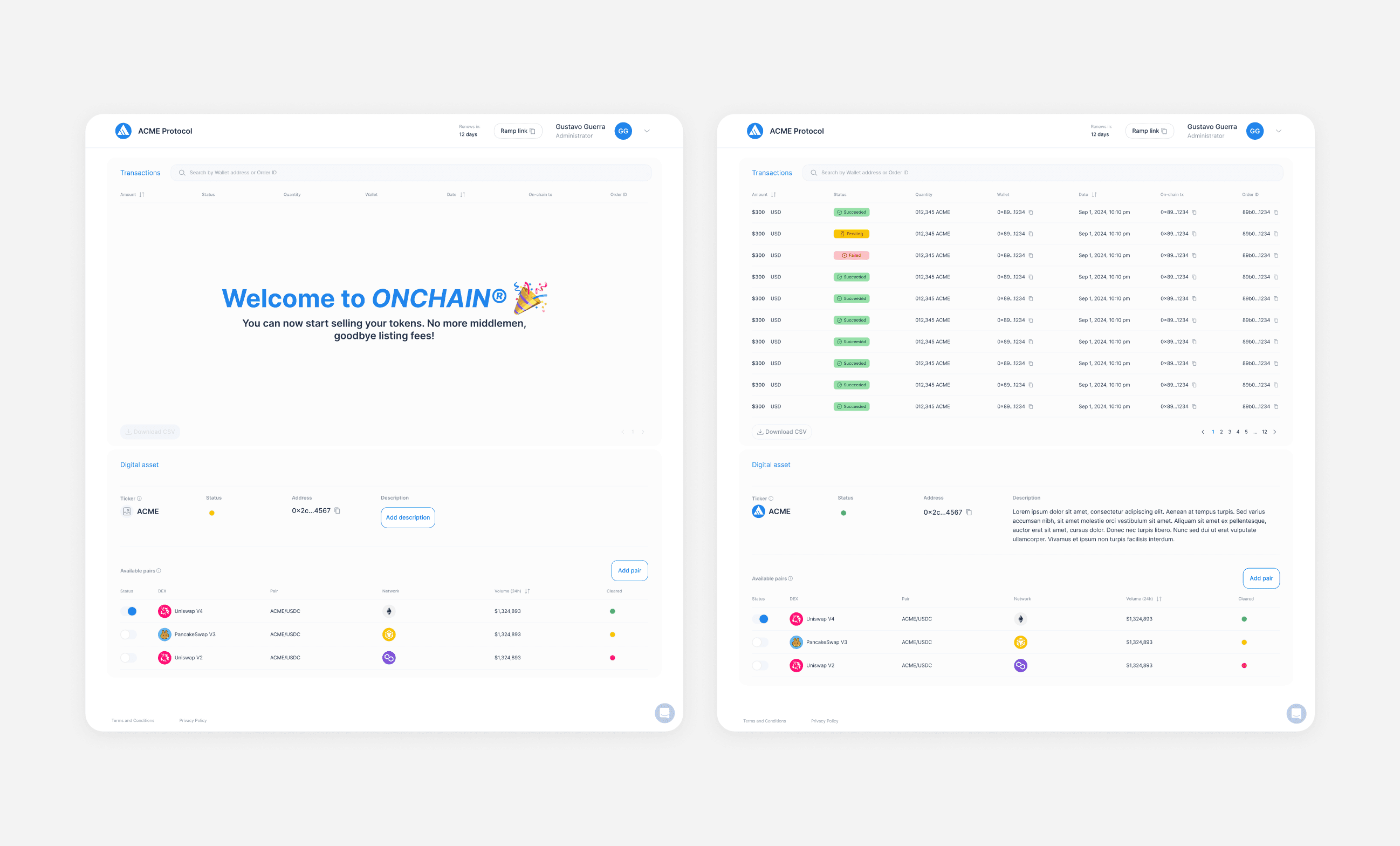
Clear transaction visibility with statuses
Structured data hierarchy
Actionable interface (add pairs, manage assets)
System states integrated into the UI
Improved readability and control
Design System Impact
Creating a scalable product foundation
Beyond UI improvements, the work established reusable patterns:
Step-based onboarding framework
Status and feedback components
Standardized form structures
Dashboard data patterns
Transaction state indicators
This enables the product to scale consistently across new features and flows.
Outcome & Impact
The redesign transformed the experience from a fragmented flow into a structured system.
Impact
Reduced friction during onboarding
Improved clarity at key decision points
Increased user confidence during setup
Established a scalable UX foundation
Enabled faster feature iteration through system consistency